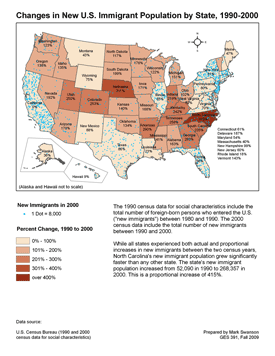
Changes in New U.S. Immigration Population by State, 1990–2000
Student project for Graduate Certificate in GIS
Northeastern Illinois University
Summary
This assignment demonstrates how to manipulate and join attribute data in ArcGIS.
My goal is to create a map that shows the changes in immigration for each U.S. state in recent years. To show change over time, I must acquire and manipulate census data for the two most recent censuses, 1990 and 2000, then join that data to the spatial attribute data of a U.S. shape file.
Procedures
Here are the steps I followed to create the map:
-
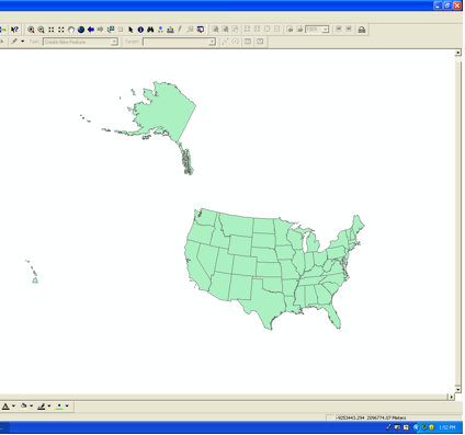
I create a new ArcMap file and load the “state.shp” layer from the class resources. This layer shows all the states of the U.S. I change the projection to Albers Equal Area so that the contiguous states are accurately proportioned.
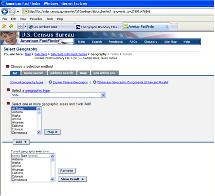
- I visit the U.S. Census Bureau’s "American FactFinder" Website at http://factfinder.census.gov/ to acquire the necessary table data. I use the “Census 1990 Summary File 3 (SF 3) - Sample Data” option and select “All States.”
- For my table I choose one set of data, "DP-2. Social Characteristics: 1990."
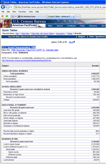
- I download the data as a Microsoft Excel file.
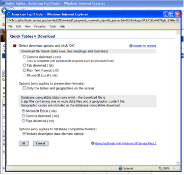
- I repeat steps 2–4 to acquire 2000 census data.
- Before I can make the map, I must prepare the data. The census Excel files contain dozens of fields, but I need only a few, so I decide to create a new Excel file that has only the fields I need. First I make sure to identify the field that I'll use for linking the census data to the shape file (“GEO_ID2” = state FIPS number). In addition to the requisite state name and ID fields, I need the fields for new immigrant data:
- From the 1990 census: "Nativity and place of birth; Total population; Foreign-born population; Entered the U.S. 1980 to 1990; Number"
- From the 2000 census: "Nativity and place of birth; Total population; Foreign born; Entered 1990 to March 2000; Number"
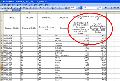
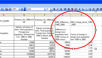
- The best way to show changes in immigration is by using the percentage change from the 1990 census to the 2000 census for each state. This data doesn’t yet exist, so I must create it. I create two columns to make this calculation: 1) the difference in population from 1990 census to 2000 census, and 2) the factor of change compared to 1990. This latter column, multiplied by 100, would be the percentage. (I will repeat the percentage calculation later using ArcMap tools so I can verify my first calculation.)
- I prepare the Excel file by removing the unnecessary header row and convert the table to a .dbf file. I import the .dbf file into the map and open the table to verify the contents. I note that the table headings have been shortened, so I'll have to keep that in mind when I create the percentage calculation in ArcMap later.
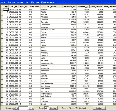
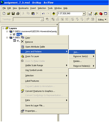
- I right-click the States layer and select Joins and Attributes > Join…
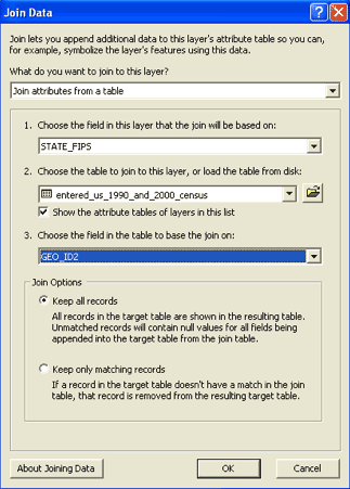
- I specify the files I want to join together and the matching fields I want to use to make the join (STATE FIPS and GEO_ID2):
- After joining the tables, I open the attribute table for the States layer and scroll right to see the joined data:
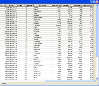
- I’ve already calculated the difference in foreign-born populations from 1990 to 2000 in the Excel file. I can use the ArcMap tool to calculate the percentage change by dividing the difference by the 1990 population.
First, I create a new field, “state.percent”:
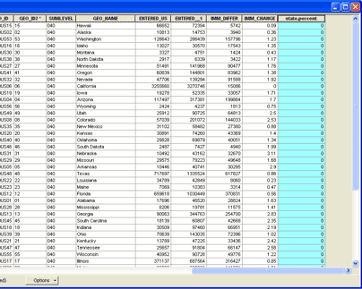
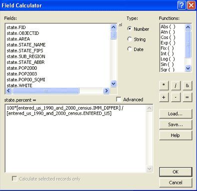
- I then use the Field Calculator to calculate the percentage change from the 1990 census to the 2000 census:
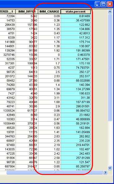
- Fortunately, the percentage calculations are consistent with the calculations I made earlier in Excel:
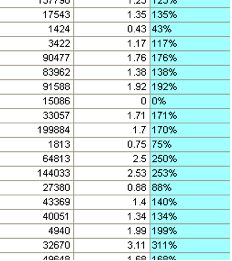
- For display purposes, I change the format of the number to “percentage” with no decimal places:
- I give my "percent change" layer temporary symbology to create a choropleth map (which I will refine later). I also display layer labels so I can see what I'm working with. I realize that, to show Alaska and Hawaii in the same 8 ½ by 11 map, I’ll have to use three different data frames: contiguous, Alaska and Hawaii. But I also realize that Alaska and Hawaii are oriented in an unfamiliar manner since the layers are projected using the contiguous U.S. projection.
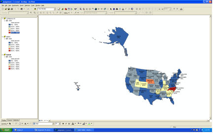
- To preserve familiar orientation of Alaska and Hawaii, I change their projections to Alaska Albers Equal Area Conic and Hawaii Albers Equal Area Conic projections, respectively. Now they can be placed closer to the contiguous U.S. for layout purposes (but not in the same scale).
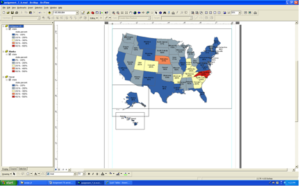
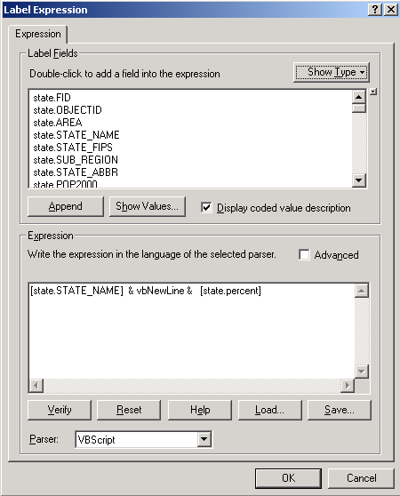
- An interesting challenge is labeling the map objects. I want to include both the state name and its exact percentage, rather than just rely on the legend. I decide to make use of the Label Expression function so that the state name and percentage are displayed together in the same label:
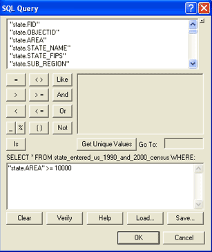
- Another labeling challenge is presented by the states in the contiguous United States. Due to my choice of map extent, many of the states are so small that their labels do not appear, and others appear a bit too crowded. To gain more control over the labels, I use the SQL Query function to specify that only states with an area greater than 10,000 square miles should be labeled. The drawback is that I will have to manually create a list of the non-labeled states in another part of the map.
- I refine the symbology for the "percent change" layer by choosing a more appropriate color ramp (light to dark). I then decide to create another theme: new immigrant population for 2000, which I depict by the dot density symbology method. This second theme helps to convey the difference between population and percentage change; for example, the states with the largest new immigrant populations (California, New York, Florida, etc.) are not necessarily the states with the fastest rates of immigration.
- I refine the layout, adding light gray boundaries around Alaska and Hawaii to indicate that their orientations and distances relative to each other and to the contiguous states have been purposefully distorted to fit on the same page. I then create a legend and add annotations and descriptive text to create the final map:
